“Simplicity is the ultimate sophistication.” Steve Jobs was not the first to enlighten us with this quote; it was that brilliant Renaissance man, Leonardo Da Vinci, who coined the phrase. Simplicity and clarity are important factors in human perception and how we process visual information. One could possibly argue that Leonardo’s statement was a premonition for the future: a future where our human brains act as computer servers, constantly receiving information from an infinite amount of devices. Luckily, our brains have the intuitive ability to reduce information down to what’s essential and relevant. Our brains focus on what we perceive as important, and everything else fades to the background. As interaction designers, our challenge is determining not only what to include in our designs, but how to visually communicate key messages, so they are retained by our audience.
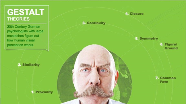
Before putting pen to paper (or tablet), it is best to understand the fundamentals of human perception. Luckily, some large-mustached German fellows (or at least that is how I imagine German scientists to look) in the early 20th century made things easy for us by observing and documenting how the human visual system works. To better demonstrate these principles, I challenged myself to create visuals that use simple shapes.
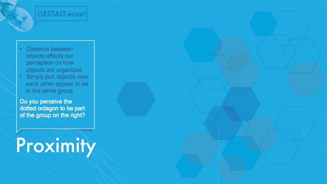
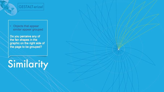
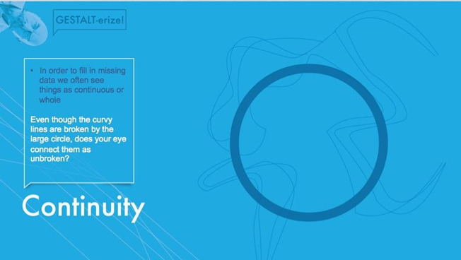
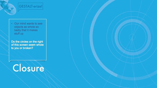
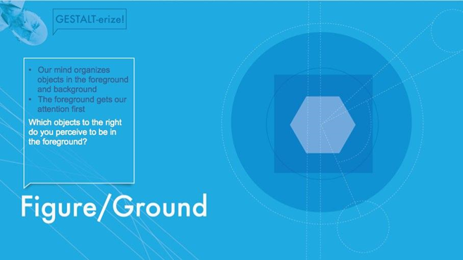
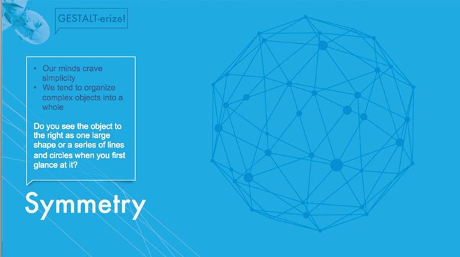
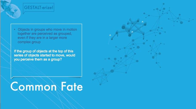
Let’s have a little fun. Test your understanding of the Gestalt principles and see how many you can spot in this screenshot.
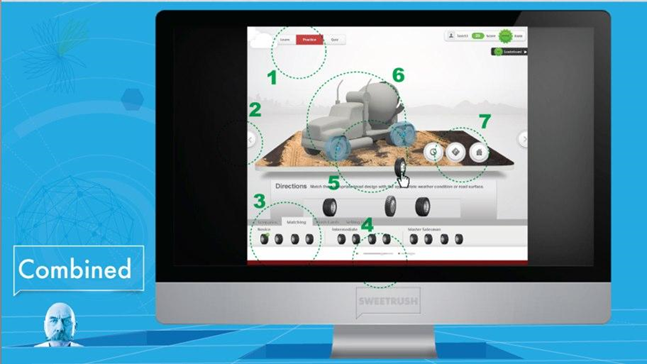
How did you do? Compare your answers with mine.
- Continuity: Even though this bar goes behind the cloud, our eye continues on to make it a whole piece. This is also Figure/Ground because the cloud appears to be in front of the bar. Do you see continuity in any other place? Check out the skyline in the background.
- Closure: Even though the back and next arrow button circles are cut off, we know that they are circles.
- Proximity and Similarity
- Continuity is also seen here in the sliders.
- Common Fate: In the final version of this drag and drop, the hotspots blink in unison so the learner knows that this is the group where the tire can be dropped.
- Symmetry: This 3D object, though complex, is recognized by your mind to be a familiar shape: a dump truck.
- Figure Foreground: Items seem closer than the ground floor.
Thanks for reading, and stay tuned for more visual design lessons.


(1) Comment
Comments are closed.